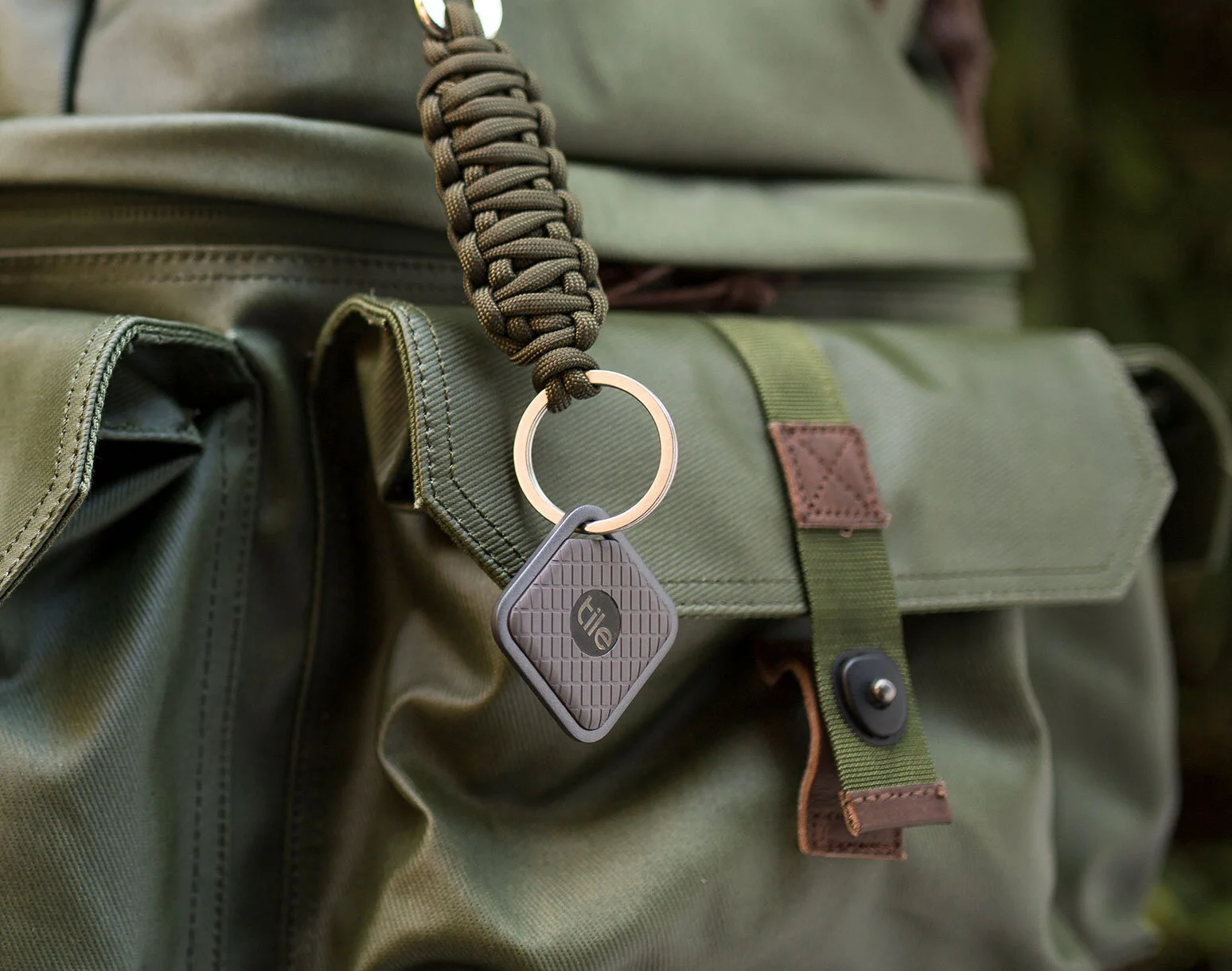
Tile Pro Launch
Tile needed to update their website and launch their new Pro Series.
Challenge
Optimize the user experience on tile.com and create awareness for the new Pro Series.
Simplify and Educate
The home screen was designed to quickly communicate what tile is through four easily scannable steps. The design also provided a short product demo video for those who wanted to learn even more.
Make the Navigation Visual
Tile’s beautifully simple product design was used to showcase the product even in places like the navigation. This also helped to reduced the cognitive load.
Solve for MOBILE-FIRST
Everything was designed with a mobile-first approach and then optimized for desktop and tablet.
Make the Product Come to LIfe
When introducing two new products that fit into very different parts of a person’s life, it was important to move away from a site that was mostly made up of renders and show the products in context.


